Unnamed Tower Defense Game Part 2: Art Design
I personally think that when it comes to game development, especially solo game development, nailing down your art style early in the process is extremely important. You can and should use placeholder art to speed up your development process but having a vision for what your game looks like is arguably the most important part of designing a game. Every time I have started a project previously I have ended up losing interest or giving up because I didn't feel that I (a non-artist) could properly execute an art style for that particular type of game that would be both possible and appealing.
For this reason, when I sat down last April to start prototyping my new tower defense game, the very first thing I considered was my art style. The mechanical theme of poker was already cemented at this point but I knew I wanted something that would be relatively easy for me to execute. I don't have much experience with 3D modelling, but my previous attempts to build games using pixel art have ended in me getting frustrated and giving up. Pixel art really isn't the beginner-friendly art style most make it out to be. You can cobble something together that looks bad pretty easily but creating beautiful pixel art is something that takes years of practice. At the same time I was pondering the beginnings of this project Balatro had been (and still is) blowing up majorly. I played the game a bunch and really loved the video poker sort of style but a pure video poker style isn't something that would work for my game outside of the UI so with that inspiration I decided to tackle "video poker" from a new angle.
I'm not sure where I had the epiphany but the art style I ended up settling on was a synth/retro/vaporwave-inspired color pallete and an abstract wireframe 3d style. I thought the synthwave colors would mesh well with video poker seeing as video poker itself was a product of the late '70s and early '80s where many of the synthesizers sampled by synthwave artists came from. This also gave me a good direction to look down for doing music down the line. (a discussion for another time) After this discovery, the first thing I did before writing a single line of code was to start drafting up some quick and dirty wireframe pieces. I wanted to see if I could come up with a pipeline for art to game that wouldn't be too time consuming while producing a decent and appealing result.
Thankfully because I posted about my progress to my friends in Discord I still have all of the files even though I formatted my computer recently. My first thought for tower design was to do something chess-inspired so the first piece of art I put together was this:
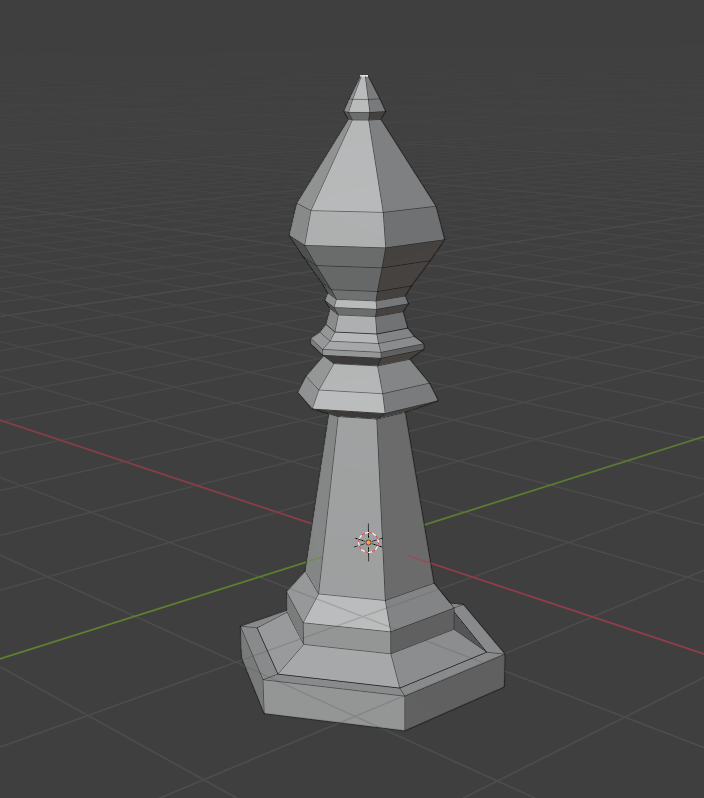
This ended up not being the direction I would go but it was good enough to figure out my rendering situation. I experimented for a while doing render tests in Godot, which would end up becoming my engine of choice for this project. I experimented with edge hightling and pixelization shaders to try and create something that felt 80s.
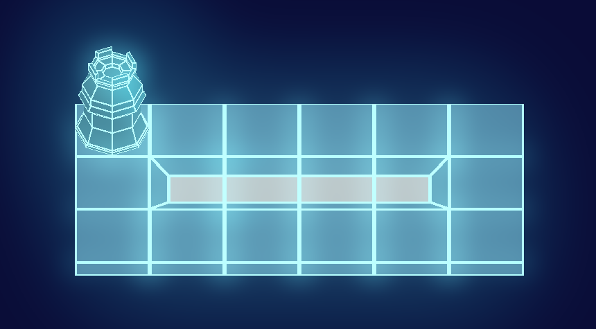
I generally liked how this looked but it was hard to get things to behave consistently, especially when using an orthogonal camera, which I knew wanted to do from the beginning. I ended up deciding that the best option was to use these abstract shapes but manually add a second material via blender's inset tool. This meant I could decide exactly which edges had the wireframe look and which didn't, without it being a major headache in terms of process. I also wasn't concerned about polygon count since my meshes were already so low-poly.
Here's an image from a little bit later in my process, showing a tower along with the first attempt at rendering the level (hasn't changed much since then.)
At the same time I was working out the 3D aspect of the art style I was also thinking about UI. Using the vaporwave color palette I threw together to figure out 3d, I drafted up some cards in Aseprite.
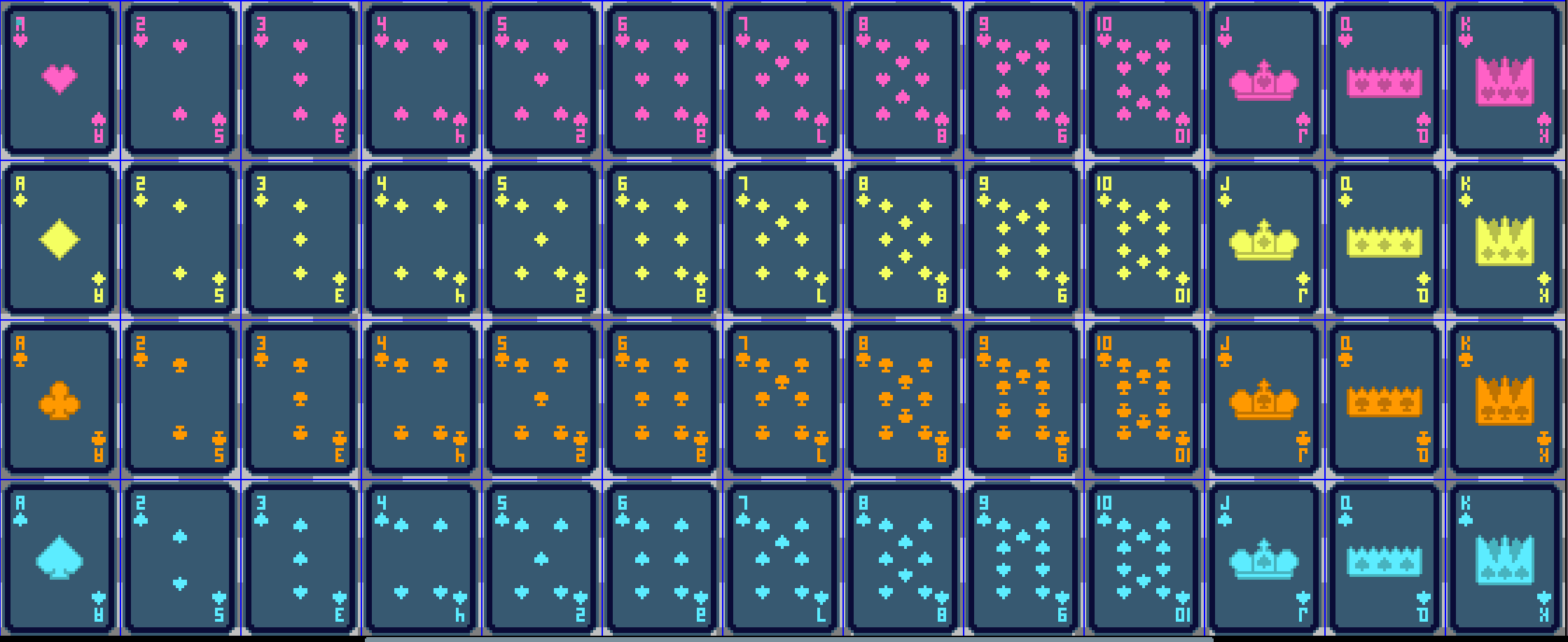
I personally thought these were a slam dunk. They took up minimal space on the screen but read very well at a distance. I had a standardized 5x5 pixel size for suit symbols which meant I had to make some sacrifices in terms of readability but my attempts at using bigger symbols ended up making cards that I thought looked much worse overall. These cards conveyed all the information I needed to and, despite their small size, read well on big and large screens alike. The colors here correspond to their elemental damage type, and while the types have switched around since I made this first draft, the basic design of the cards has not. I also threw together some basic textures for doing quick and dirty UI panels but honestly after comparing how my game looks to how 80s video poker machines look, I don't expect there to be much of a difference between what I have now and what the final product will look like.
So how does the game look at present? Well, have a look:
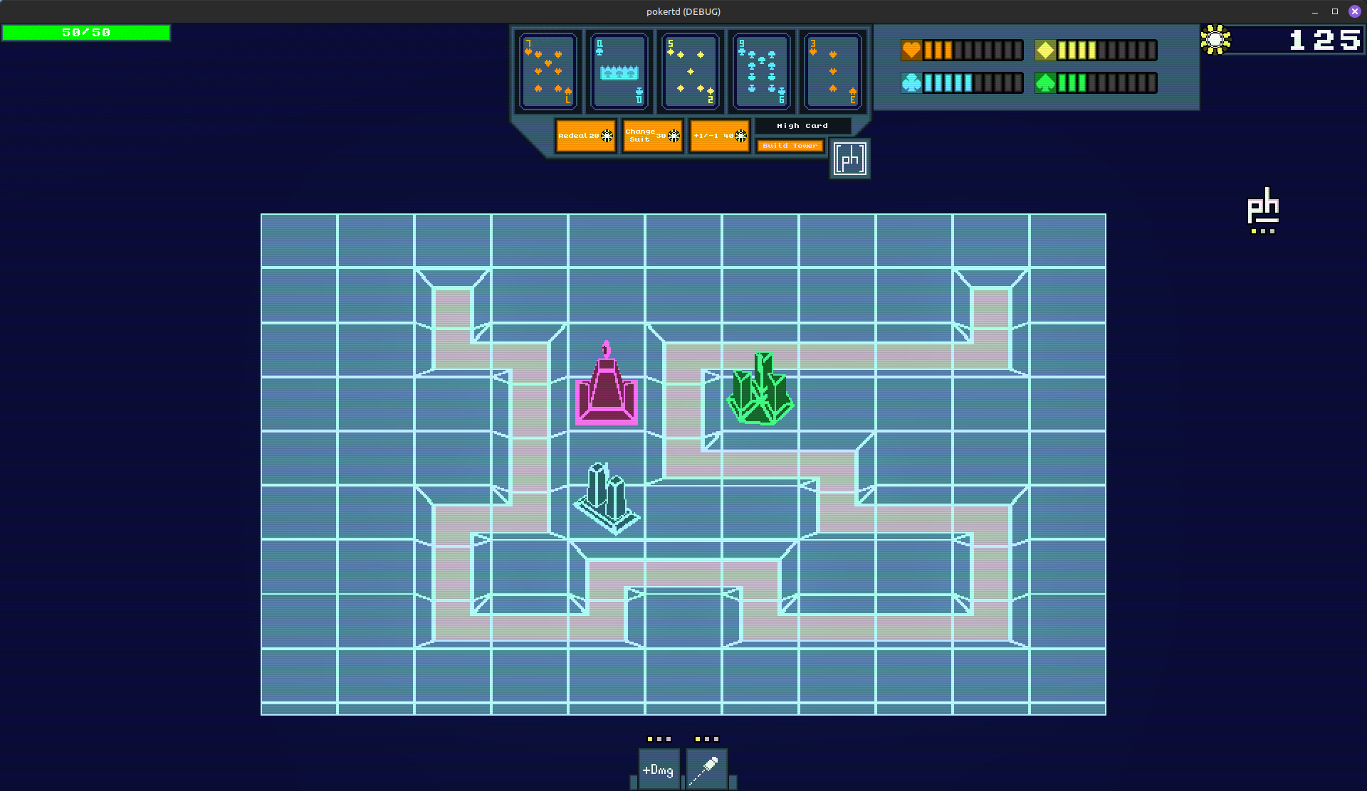
It's not the most impressive looking game ever but it definitely has a style. I'm proud of the work I've done but all I can think about these days is how much more I have to do to get a finished product. There's still a lot even in just this image and short clip that is unfinished or a placeholder.
Join me next time for... code? I guess code.